
Page Structure
Core pages and important sections are organized into a logical structure so every piece of information has a clear place within the website.
BrandifyReach creates modern websites around clear structure, responsive behaviour and practical user experience. From early page architecture to polished interface development, every stage is considered carefully so the finished website feels professional, organized and ready to perform across desktop, tablet and mobile.
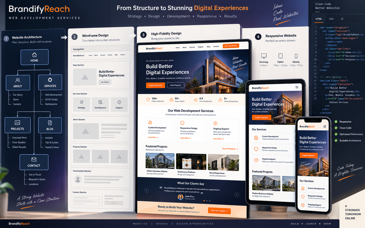
Structure, navigation, content placement, responsive behaviour and technical implementation all shape the final experience. Our approach connects these elements from the beginning so the website feels clear, usable and consistent throughout the complete digital experience.
Before visual styling begins, the website needs a logical foundation. We consider how pages relate to each other, how visitors move through the experience, where important content belongs and which actions should remain easy to reach.
Core pages and important sections are organized into a logical structure so every piece of information has a clear place within the website.
Navigation and page relationships are considered around how visitors discover information and move toward useful actions.
Headings, written content, imagery and calls to action are given appropriate space within a clear visual hierarchy.
Important enquiry and contact actions are positioned naturally so visitors can reach the next step without an overloaded experience.
Different websites have different jobs. We shape the structure, content flow and interface around what the website actually needs to achieve rather than forcing every project into the same layout.
Professional digital foundations for businesses that need a clear, credible and organized online presence.
Structured websites that explain services clearly and guide visitors toward enquiries and useful actions.
Presentation-focused websites for showcasing experience, capabilities, creative work and professional projects.
Focused pages developed around a particular offer, campaign, service or conversion objective.
Flexible WordPress builds developed around organized content, responsive layouts and practical website management.
Website solutions shaped around specific structures, pages and digital requirements when a standard layout is not enough.
We move from requirements and website structure into interface development, responsive behaviour and final review so each stage has a clear purpose before the website reaches launch.
Define the website purpose, audience, required pages, functionality and overall project direction.
Establish how the main pages connect and create a clear structural foundation for the complete website.
Plan sections, hierarchy, navigation and content areas before detailed visual styling begins.
Transform the structural foundation into a polished interface with clear visual hierarchy.
Turn the approved interface into a functional website with organized sections and interactions.
Reorganize layouts for tablet and mobile so the experience adapts naturally to available space.
Review navigation, layouts, links and responsive behaviour across relevant screen sizes.
Prepare the completed website for its live environment after final structure and experience review.
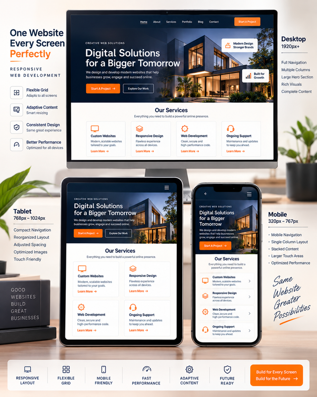
Responsive development is not about shrinking a desktop page until it fits on a phone. Navigation, columns, imagery, spacing and interaction need to reorganize intelligently as the available screen space changes.
Columns and sections reorganize according to available screen width.
Navigation becomes more compact and practical on smaller devices.
Typography, imagery and spacing adapt to preserve clear hierarchy.
Buttons and interactive areas receive appropriate space for comfortable mobile interaction.
Visitors see the finished interface, but the quality of that experience depends on decisions underneath it. Structure, responsive behaviour, visual weight and cross-device review work together to create a website that feels stable and professional.
Pages, sections and content relationships are organized clearly so the website remains easier to understand, manage and extend as the project grows.
Layout decisions are reconsidered at different screen widths so the website adapts naturally instead of relying on a compressed desktop layout.
Image use, layout complexity and unnecessary visual weight are considered carefully to support a cleaner and more efficient website experience.
Important layouts and interactions are reviewed across different screen sizes to identify spacing, hierarchy and usability issues before completion.
A website can contain the right information and still feel difficult to use. Smaller decisions around navigation, spacing, readability and interaction often determine whether the overall experience feels polished and intuitive.
Important destinations remain easy to understand and reach without an unnecessarily complicated navigation structure.
Comfortable spacing separates ideas and gives important content enough room to communicate without making pages feel empty.
Calls to action appear at natural decision points where visitors are most likely to need a clear next step.
Text areas remain at practical widths so longer content stays comfortable to scan across different screens.
Smaller screens receive their own spacing, stacking and interaction decisions instead of a compressed desktop page.
Typography, buttons, imagery and spacing maintain consistent relationships across the complete website.
The final website brings planning, interface design and responsive development together into one connected experience prepared for real visitors across modern screen sizes.
Layouts prepared for desktop, tablet and mobile
Clear page sections and organized content hierarchy
A polished visual experience developed around the project
Layouts and interactions prepared for smaller screens
Connected destinations and practical website movement
Responsive presentation reviewed before completion
Website requirements vary depending on pages, functionality, content and overall project direction. These answers cover common questions around responsive development, WordPress and supporting services.
Share what you want your website to achieve, the pages you need and any existing content or visual direction. BrandifyReach can turn those requirements into a structured, responsive and professional digital experience.